Using Adjustment Menu
The Adjustment Menu situated at the Edit Tab lets you correct your whole image, select one of the ready presets, add a vignette or watermark.
The Adjustment Menu represents a so-called accordion menu, which contains a vertically stacked list of sections. Each of them can be opened by clicking it. Within the opened section you'll see settings that can be changed.
To increase a setting value drag the indicator of the corresponding slider to the right, whereas to decrease a value move the indicator to the left. It's also possible to enter the needed value into the appropriate box via keyboard. To apply the entered value to the edited image, press the Enter key.
The Adjustment Menu includes the following sections:
Presets
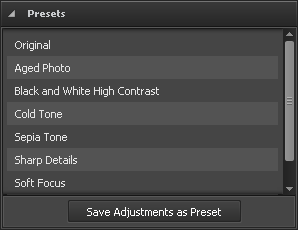
These presets represent ready parameters combinations. The result displayed after applying one of them can also be adjusted by changing color and tone settings.
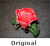
Original
This is the initial image. You can use this option to swith to the original photo after applying one of the presets.
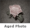
Aged Photo
This preset gives your photo an antique or aged look.
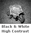
Black and White High Contrast
This preset makes your photo black and white maintaining its sharpness and contrast.
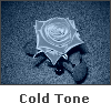
Cold Tone
This preset adjusts your image to cold colors.
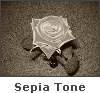
Sepia Tone
This preset transforms image spectrum to brownish which imitates faded photos and yellowish photo paper. It gives your image an antique appearance.
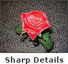
Sharp Details
This preset enhances images that lack sharp detail and depth.
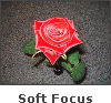
Soft Focus
This preset gives the appearance of blurring the image while retaining sharp edges. It eliminates blemishes, and in general produces a dream-like image.
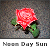
Noon Day Sun Effect
This preset lets colors bleed out and leaves images flat or blown out.
Use the Save Adjustments as Preset button to save the adjusted settings as a new preset. After that it will be included to the list and you will be able to use it in the future.
[
Back to Top]
White Balance
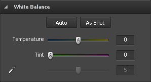
Temperature
Is used to adjust your image to warm or cold colors. Negative values represent cold colors and positive values transform to warm colors correspondingly.
Tint
Is used to adjust colors by adding white to a pure hue.
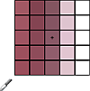
 - Tone Dropper
This button is used to activate the tone dropper that picks a standard color and helps you calculate temperature and tint values according to it. Using the slider next to the button you can set the needed size of the rectangular area.
Use the Auto button to adjust settings automatically. Use the As Shot button to restore the original settings.
[
Back to Top]
Tone Corrections
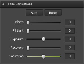
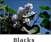

Blacks
Is used to adjust the black clipping point of an image. Increasing Blacks expands the areas that are mapped to black. The greatest change is in the shadows, with much less change in the midtones and highlights.
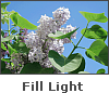
Fill Light
Is used to restore shadow detail. Increasing the value allows you to digitally shine light on dark areas and bring out detail that would otherwise be obscured without affecting areas that should be black based on the Blacks setting.
Exposure
Is used to adjust the white clipping point of an image (i.e. the overall image brightness), if your image is overexposed (too much light) or underexposed (too little light). Decrease Exposure to darken the image and increase it to brighten the image.
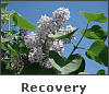
Recovery
Is used to restore highlight detail. By using this simple slider, you can easily bring back some detail from most images without changing the overall exposure or color balance. While certainly it's no substitute for getting the shot right, it's always nice to be able to get back that tiny bit of extra detail you might otherwise lose.
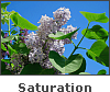
Saturation
Is used to correct the strength (purity) of colors. Saturation represents the amount of grey in proportion to the hue, measured as a percentage from -100 (grey) to 100 (fully saturated).
Use the Auto button to adjust settings automatically. Use the Reset button to restore the original photo.
[
Back to Top]
Brightness/Contrast
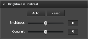
Brightness
Is used to adjust the relative lightness or darkness of the color, i.e. the tonal range of an image.
Contrast
Is used to correct the difference in visual properties that makes an object in an image distinguishable from other objects and the background.
Use the Auto button to adjust settings automatically. Use the Reset button to restore the original photo.
[
Back to Top]
Color Balance
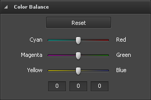
Cyan - Red
Cyan and red are chromatically opposite colors. Cyan is used to refer to the color obtained by mixing equal amounts of green and blue light or the removal of red from white light.
Magenta - Green
Magenta and green are chromatically opposite colors. Magenta is used to refer to the color obtained by mixing equal amounts of red and blue light or the removal of green from white light.
Yellow - Blue
Yellow and blue are chromatically opposite colors. Yellow is used to refer to the color obtained by mixing equal amounts of red and green light or the removal of blue from white light.
The boxes below are used for the same purpose but using keyboard. The 1st box stands for "Cyan - Red", the 2nd for "Magenta - Green", the 3rd for "Yellow - Blue".
Use the Reset button to restore the original photo.
[
Back to Top]
Detail
Use the Reset button to restore the original photo.
[
Back to Top]
Smart Corrections
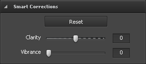
Clarity
Is used to add depth to an image by increasing local contrast.
Vibrance
Is used to increase the saturation only in the areas of an image that need it most. Less saturated areas automatically receive the most attention while parts of an image that already have some degree of saturation are affected less.
Use the Reset button to restore the original photo.
[
Back to Top]
Vignettes

This section is used to reduce or increase the brightness of an image at the periphery compared to the image center. This effect helps you draw attention to the center of the photo.
Amount
Is used to set the brightness level. Positive values increase brightness making the image lighter and negative values decrease it making the image darker.
Midpoint
Is used to set the central area size that will stay unaffected.
Roundness
Is used to set the roundness of the central area.
Feather
Is used to set the transparency level of the central area edges.
Use the Reset button to restore the original photo.
[
Back to Top]
Watermark
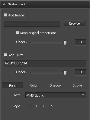
This section is used to add a watermark to your photos and protect your copyrights. You can add a text or an image that will be inserted as a watermark.
Adding Image Watermark
Add Image
Check this box to insert an image watermark.
Browse
Click this button to search for the image you want to use as a watermark. After loading the needed image file the path to it will be displayed in the field next to the button.
Keep Original Size
Check this box to preserve the original size of the image you are using as a watermark. If you keep it unchecked, you will be able to change the image size in the Preview Area by dragging its edges.
Opacity
Use this slider to set the transparency level of the image you are using as a watermark.
Adding Text Watermark
Add Text
Check this box to insert a text watermark. Enter the watermark text into the field below.
Opacity
Use the Opacity slider to set the transparency level of the watermark text.
Adjust the available text settings:
 Font
Font
- Text - select a font type for your watermark text.
- Style - apply a decoration style to your text: bold, italics, underlined, strikeout.
 Color
Color
- Color - select a solid color for your watermark text.
- Gradient - select gradient colors and set the gardient angle.
 Shadow
Check the Enabled box to add shadow to the watermark text.
- Angle - select a shadow angle.
- Distance - set a distance between the watermark text and its shadow.
- Softness - set a softness level of the shadow.
- Opacity - set the opacity level of the shadow.
 Stroke
Check the Enabled box to add stroke to the watermark text.
- Color - select a color for the stroke.
- Thickness - set a thickness value for the stroke of the watermark text.
[
Back to Top]